

Election night can be an intense, epic adventure for users. It’s a massive labyrinth of information to navigate — with updates in every form and on every surface. Users often look to find a clear answer to one simple question: What’s the latest election result? Usually my role is a design lead, but I embraced this side quest to level up my skills.

A pixel version of me, Holly Braford.
Team
product designer (Me, Holly Braford)
product manager
iOS, core and elections engineers
politics editors
content designer
news designers
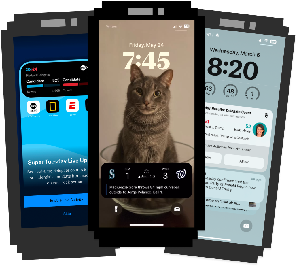
Election night brings a high volume of notifications to lock screens.
The challenge
Our quest was to make complex election night coverage more accessible and to make sure the audience stays connected to the most important updates. The solution was a live activity for mobile lock screens. This feature provides real-time election results at a glance, so that users stay informed without needing to unlock their phones or search through dense content.

It is dangerous to design alone and wise to take a product requirements document along.
The approach
Insights
To understand users needs for election visualizations, I turned to user interviews.
Many shared they want to understand things quickly and not do a ton of work to get the information.
Readers find The Post’s election coverage invaluable but want to lessen their cognitive load on election night.
Users want a range of visualizations on election night, but the balance of power was top priority.


Illustration of user interviewees.
“(I want) to understand who's gonna win, right? And like what are the factors in play that I should be watching for.”
Margery
“Politics is a big thing for me. I’m very interested in the balance of power . . . that combined with what's happening. I need help to unpack what I’m seeing.”
William
“I want to get a sense of what's the total.”
Heather

Ben Kirschner created candidate illustrations for The Washington Post.
Existing work
I audited election design work that was already in-flight. I used the established color palette and candidate illustrations, but had to abandon The Post’s typefaces to align with iOS requirements for live activities. I adjusted early concepts from the graphics team for a singular balance of power visualization based on what we learned from user interviews.
Audience strategy
I learned more about the overall strategy for elections: Robust, fast news and analysis from our entire political team on debate, primary and general election nights.
User stories
I collaborated with Product to make user stories to guide us on this side quest: The heavy refresher, Has anything changed? and Take me to The Post.
Competitive audit
I looked to see what other live activities were out there but luckily I had audited election live activities during primary season.

Sketches and concepts for standby, expanded, lock screen, compact and minimal modes.

Concepts
I sketched and made wireframes then created medium fidelity designs. After reading and then rereading the requirements I refined and pressure tested the designs with real content.
In-app message
I designed the visuals for an in-app message and worked with a content designer to promote the live activity on Election Day.
Delivery
I worked with engineering to make changes to account for the dynamic Island requirements.

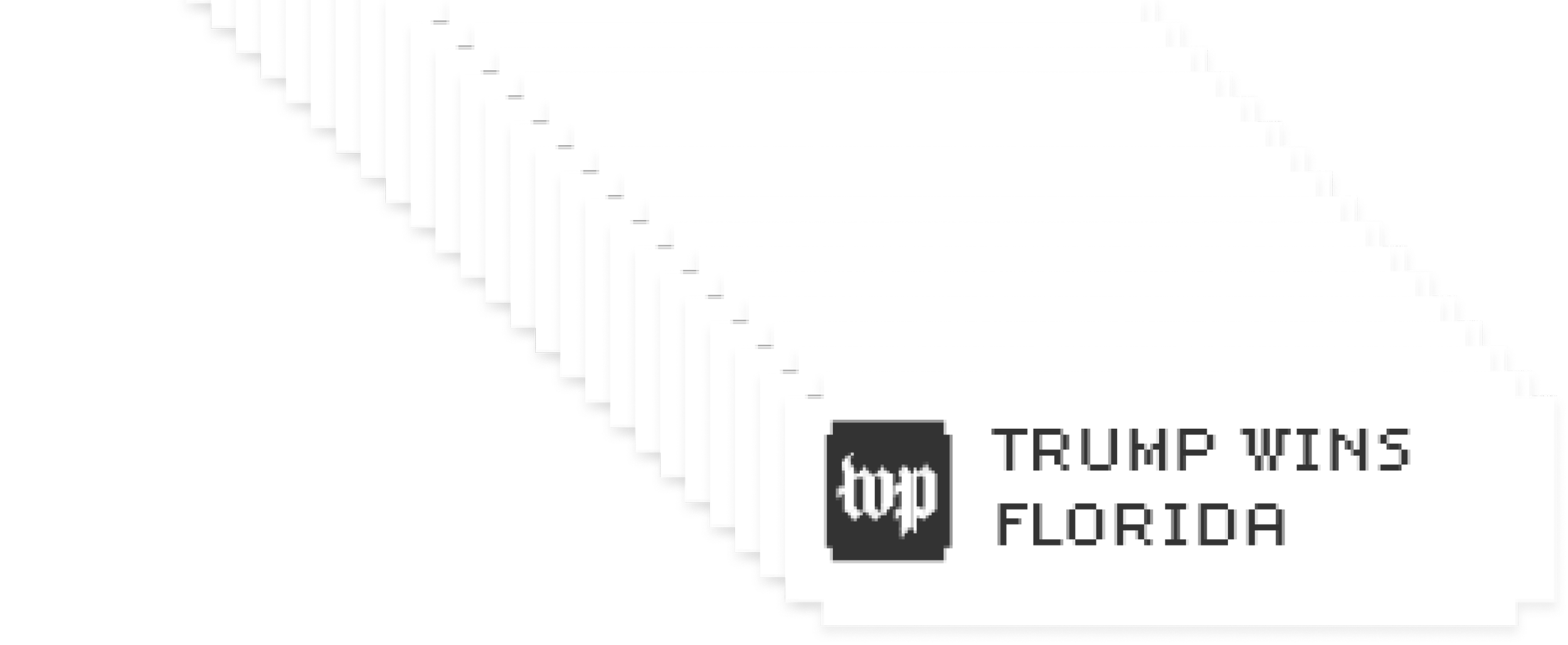
Images from the live activity on Nov. 5 and 6.
The results
The live activity drove engagement on election night with nearly a quarter of iOS app users accepting the live activity. Among those users, 75 % clicked-through on the lock screen to get to the app and 57% clicked through multiple times.